Hello there and welcome to Color Week at Hero Arts. Not only have we revamped two of our ink pad lines (and combined them in to one), we have new colours of inks, cardstock and now reinkers for all of the new line too! Over the week, there will be blog posts on the
Hero Arts Blog with more information and sharing ideas using the new products, but today, we are kicking off with a fun blog hop with a fabulous giveaway too. I will share more information on the hop and the new products a little later but first, let's get on to the project that I am sharing with you today.
PLEASE
NOTE: This post contains affiliate links. Please see below for my full
disclosure.
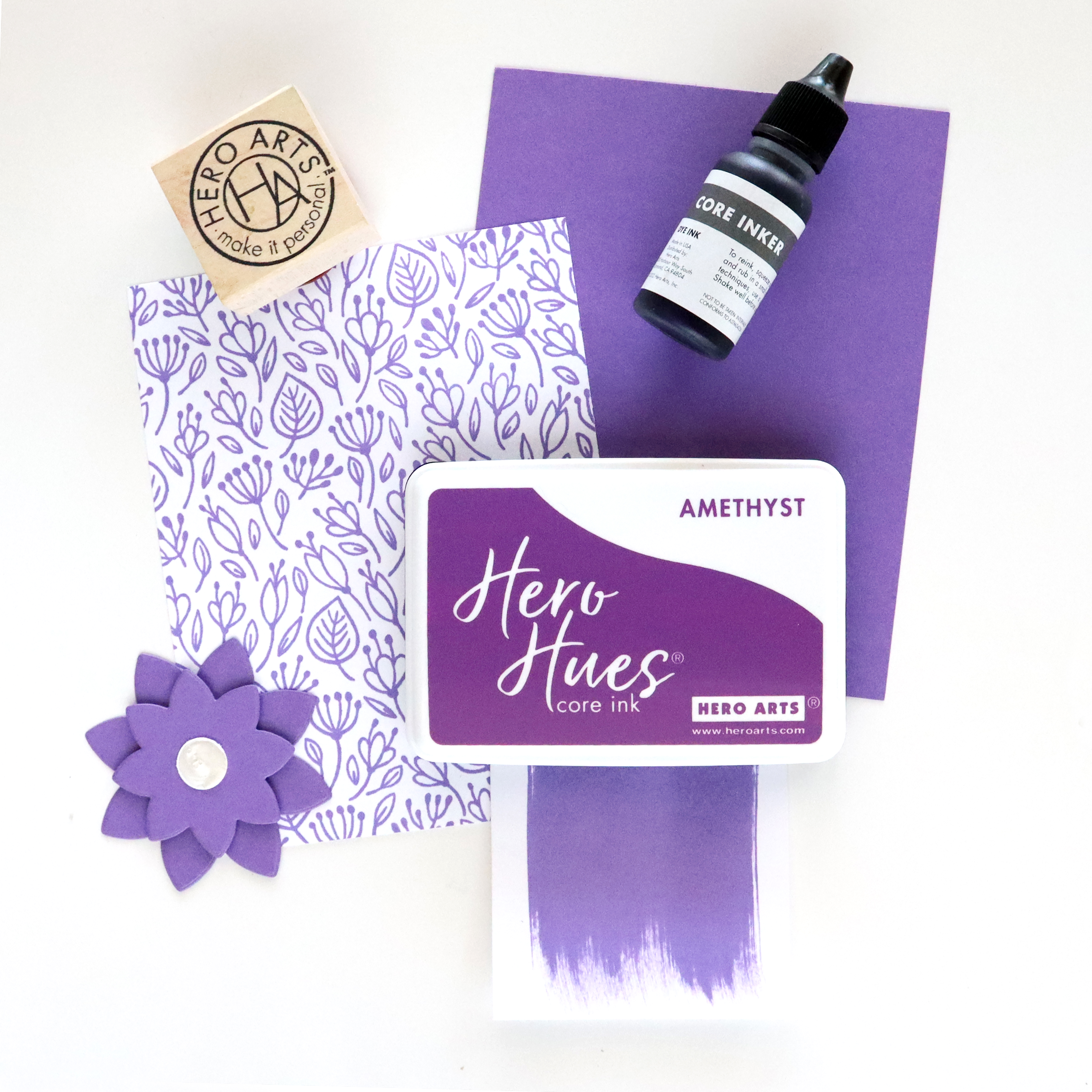
My focus for my project today is on the new
Hero Arts Amethyst Core Ink, which matches the already released Amethyst Cardstock and is a beautiful colour. This particular ink pad is a dye formula (some of the Core Ink colours are dye based and some are hybrid. I will get on to that a little later!).
I started off by taking a 3.25" x 4.5" panel of
Hero Arts Deluxe Smooth White Cardstock. Starting at the bottom and using Post-It Tape, I masked off a section at the bottom for my darkest saturation of colour. Using the Amethyst Core Ink direct to paper, I swiped it over that section multiple times.
I removed the Post-It Tape and moved it further up to create another section, for this section I used a
Hero Arts Extra Large Ink Blending Brush to apply the ink. I did this for the rest of the panel, moving up with a slightly less saturation of ink until I got to the top and used the lightest touch. I wanted to show you how light you can get the ink and also how dark!
I didn't get a perfect Ombre but I did like the finished result none-the-less, although I did go back and add more saturation to the darkest layer at the bottom and it did bleed slightly which was a shame. I should have used a new piece of Post-It Tape, but you live and learn!
SUPPLIES:
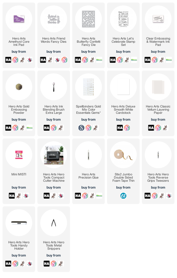
Here are the links to
what I have used on the project. Affiliate
links are used on some products. This means that if you make a purchase after
clicking on my link, I receive a small commission with no extra cost to you. I
truly appreciate your support when using these links. Please click on the logo below
the product to shop at your favourite store. All products were personally
purchased except those from Clearly Besotted, Hero Arts or those marked with an
asterisk (*) which were kindly sent to me to use. You can read my full
disclosure here.
NEW CORE INK COLOR SYSTEM
Announcing our new Core Ink line! Adding color to your
projects could not be easier. This essential collection is the ideal ink for
your everyday stamping and cardmaking. It includes fresh new colors and popular
existing formulas to create a tightly designed color system. Each Core Ink pad
features a new look with a palette on the underside of the lid. By popular
demand, we are excited to now offer matching Inkers for every color! The Hero
Hues line is rounded out with cardstock, specifically selected to work well
with the Core Ink spectrum.
There are 57 Core Ink Pads and Inkers in the new Hero Hues Core Ink system. Six of the colours are brand new (shown in the photo above). The other colours are existing ones - some of these have new names and other's their name has stayed the same.
This new line is a mash up of the previous Shadow Ink line and Bold Ink lines. That means that although they are called Core Inks, some of the colours have the dye formula and some have the hybrid (part dye and part pigment) formula. This is because some colours just work better in some formulas than others. Each of the inks will be clearly labeled accordingly with what formula they are.
Also releasing today are 12 new cardstock colours. A lot of these match with the existing colours of ink and are so lovely! You can find out more about the new launches and how the system works here.
COLOR ME ORGANIZED PROMOTION
If you purchase any 6 Core Ink Pads or Ink Pad + Inker Bundles, you will receive a free pack of Core In Pad Labels. Promotion runs from June 20th to 26th June. These labels can be purchased separately
HERE too.
As mentioned, this blog post is part of a fun, inspirational blog hop with prizes. For the hop, you should have arrived here from the amazing
Seeka. Next on the hop is the fantastic
Lydia. If you get lost along the way, or want to start the hop from the beginning, please head over to the
Hero Arts Blog.
We will be giving away one set of the six NEW
colors of ink - Core Ink Pads and Inkers - to one lucky commenter. We encourage
you to comment on every blog in the hop - the more blogs you comment on, the
more chances to win! Comments for contest entry close Sunday, June 26 at
11:59pm PT, and the winner will be announced on the Hero Arts blog the
following week.
Thank you so much for stopping by to see me today. I really do appreciate it. I will be sharing a little more about the new Inkers later in the week but in the mean-time, I hope you enjoy the rest of the hop and have a great week ahead!


Oh my goodness....this is so beautiful.
ReplyDeleteVery neat Michelle!
ReplyDeleteOoh, I love that amethyst!
ReplyDeletePurple is my fave color! Love the white/gold 'hello' - so pretty with the ombre of purple.
ReplyDeleteOMG! The purple is AMAZING!!!!
ReplyDeleteLovely shading!
ReplyDeleteWhat a cool card! I love the background you created. :)
ReplyDeleteI love the purple!!!! Awesome creation!
ReplyDeleteLove this purple!!!!! Awesome creation!
ReplyDeleteSo very beautiful! I love that purple and I didn't even notice the bleeding until you pointed it out!
ReplyDeletePurple is my favorite color you really did it justice. Thanks ^-^
ReplyDeleteI like the ombre background, touch of old and cute butterflies.
ReplyDeleteHow pretty. It reminds me of the lyrics: Purple mountains' majesty....
ReplyDeleteAmethyst all the way! What a lovely clean, crisp card and a perfect way to showcase this gorgeous colour with these gradients.
ReplyDeleteBeautiful! Love the Amethyst!
ReplyDeleteThis is so gorgeous and love the way you gold dipped part of the sentiment!
ReplyDeleteI love the ombre effect and how you added the gold embossing powder to the die cut sentiment! So cool!!
ReplyDeletePurple and gold, my old high school colors!
ReplyDeleteWhat a beautiful card and new ink colors, I'm loving the ombre effect on the background
ReplyDeleteI love your beautiful purple!
ReplyDeleteLove the cute little butterflies - adds a nice sweet touch!
ReplyDeleteI love how you showed off all the pretty purple hues!
ReplyDeleteWhat a great way to show off the versatility of the ink. You did a beautiful job!
ReplyDeleteLove your card. And the embossed sentiment
ReplyDeleteI love the purple and gold together! So pretty!
ReplyDeleteLove this amethyst and the shades of purple. Thank you for sharing.
ReplyDeleteWhat a great way to show that purple! I liked how you did the layers with the same ink but different applications.
ReplyDeleteBeautiful card! What a fantastic color.
ReplyDeleteThanks for sharing.
Such a beautiful card! What a fantastic color.
ReplyDeleteThanks for sharing.
That ombre effect is awesome. I'm definitely going to try this technique.
ReplyDeleteWOW that card is an eyecatcher. Love your blending and that color... tyfs :)
ReplyDeleteStunning card, I think you got a great ombre with just one ink - amazing the difference in the saturation. And of course it had to be purple! It looks beautiful with the semi embossed gold die cut too. Gorgeous!
ReplyDeleteso beautiful
ReplyDelete